The Life Scientists’ Guide to Creating an Award-Winning Poster
If you’re attending a science conference this year, you might be thinking about presenting a poster to showcase your latest research. Poster presentations are a valuable way for life scientists to share their ideas with others, network with experts, and gain useful feedback.
Most conferences offer researchers the chance to present their posters in dedicated exhibition spaces, and some even offer prizes for ‘Best Poster’ at that particular event. Awards like these can be considered quite prestigious, and success in one of these competitions will certainly do no harm to your CV!
So what does it take to design, produce and present an award-winning poster? Which elements do you need to include? What are the biggest mistakes made in poster design? We spoke to three previous prize-winners - Matthew Wilkinson, Russell Cochrane, and Caroline Manicam - and asked them to share their best advice for creating an award-winning poster!
Why should you submit a poster to a conference?
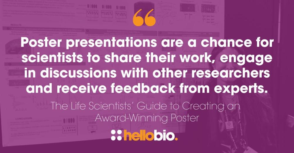
Poster presentations are a great opportunity for scientists to share their work, engage in discussions with other researchers and receive ideas and feedback from experts working in the same field.
-
Showcase - Posters are a valuable platform to show off your work, your research interests, and your capabilities as a scientist
-
Network - Through poster presentations you are likely to meet and connect with other scientists working in the same field or on the same research topic as you
-
Learn - Discussions with peers and experts will help you to refine your ideas, identify potential improvements, and gain new perspectives on your research work
-
Develop - Poster presentations offer an opportunity to practice and build on your existing science communication skills
-
Enhance - Your CV and research profile will also receive a boost as poster presentations demonstrate active and positive engagement within the scientific community
Planning & designing your poster
A scientific poster should offer an informative and engaging visual representation of your research work. It should allow the reader to understand complex ideas easily, and should tell the story of your work in a clear and accessible way.
Think about your audience
During the early stages of planning your poster, it’s essential to consider who will be looking at your work and what you want them to take away from it. Are you presenting at a specialist conference for experts in your specific field, or at a more general science event? Will members of the public be in attendance? Think about who might view your poster and how your choice of wording, graphics, and other elements could have an impact on audience engagement.
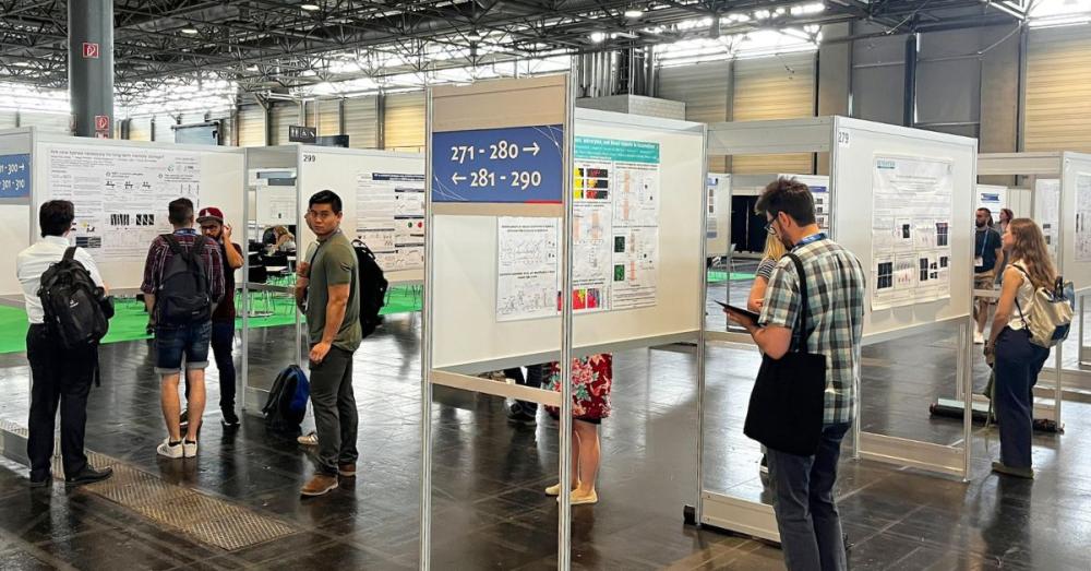
Pictured: The poster exhibition hall at FENS 2024
Designs & dimensions
A poster will typically be printed on a large sheet of paper, card, or fabric, and will often include graphs, tables, and figures alongside the text. Common sizing for a poster is around 48 inches wide by 36 inches tall. It should be visually eye-catching and should convey your key findings to the reader without overloading them with information.
-
Title - Choose an engaging title for your poster which clearly conveys the content of the poster to the reader
-
Clarity - Keep your design as clear and simple as possible. Avoid clutter and use a logical flow to help your audience make sense of your processes and outcomes
-
Visuals - Think carefully about using colour, fonts, and white space to enhance the impact and engagement of your poster
-
Key Sections - A poster should include your Abstract, Introduction, Method, Results, Discussion and Conclusion
-
Graphics - Make use of graphs and charts to help convey the details of your work
TOP TIP: Always check with the event organisers for their guidance on dimensions for your poster before sending your work to be printed. Sizing can vary and will depend on the presentation space available at each conference.
Use separate sections to tell a story
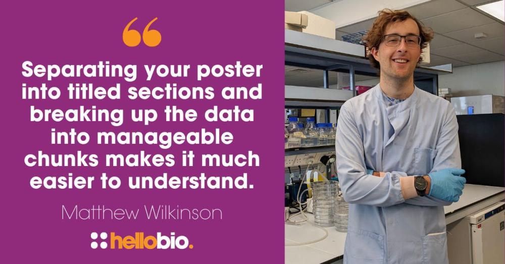
Dr Matthew Wilkinson is a Product Development Manager at Hello Bio who has previously won awards for his poster presentations. He recommends using a story-telling format which separates the information into more manageable pieces. He said:
To make a poster layout both visually appealing and easy to follow, I think the key thing is to work out from the start what your story is, then format the poster to tell that story in a clear way. This invariably takes the form of 1) what is the problem, 2) what did we do to try and solve the problem, and 3) what were the conclusions of this. Separating your poster into titled sections and breaking up the data into manageable chunks makes it much easier to understand.
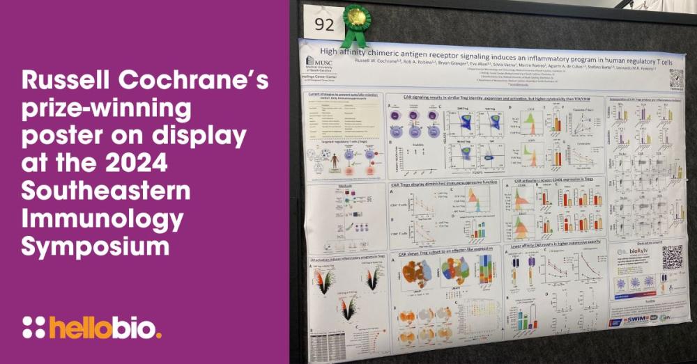
Russell Cochrane is a PhD Candidate at the Medical University of South Carolina who won the Young Investigator Poster Award at the 2024 Southeastern Immunology Symposium at the University of Alabama at Birmingham. He agrees with Matthew’s story-telling approach when it comes to design:
For me, the layout starts with storytelling — I want the audience to easily follow the progression of the research. The simpler the better! I use clear section headers and plenty of white space to keep it clean and avoid overwhelming the reader. I also make sure that the most important takeaway is front and center, either in the title or conclusion, so it’s immediately obvious why the work matters.
Choosing valuable visuals
The visual elements of a poster are very important, and you should think carefully when choosing which data to display in a graph or chart. Any images or diagrams included in your poster design should be of high quality, and should be used strategically to illustrate the key points of your research. They should be labeled clearly, with legends and captions to explain the data without ambiguity. Matthew Wilkinson shares some great advice on the use of visuals:
The graphs and images are the most important part of the poster as they’ll provide the data to support your story. However, it’s important to only show the most relevant pieces of data that are needed to back up what you are saying. Don’t just copy and paste Figure 5 from your most recent paper! Try to make them as visually appealing as possible through use of colour and formatting, and be sure to make them big enough to be read from a distance.
TOP TIP: Add a QR code to your poster which provides an automatic link to more in-depth information about your research. This is a quick and easy way for readers to follow up and learn more about your work.
Present your poster with confidence
At most conferences you will be expected to stand with your poster so that you are on hand to talk through the details with conference attendees who are interested in finding out more. This offers you a great opportunity not only to express the importance of your work, but also to answer questions and network with others for potential collaborations.
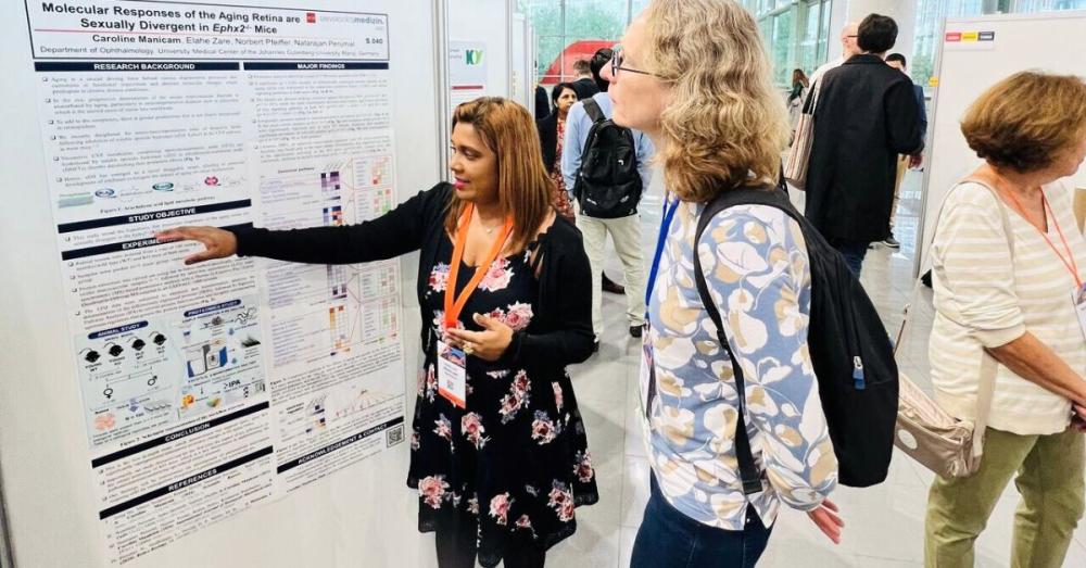
Pictured: Dr Caroline Manicam (left) presents her poster at the 2024 European Association for Vision and Eye Research Congress
The elevator pitch
An elevator pitch is a 30-60 second summary of your research that is brief yet compelling enough for the listener to want to find out more. A good elevator pitch will communicate the essence of your work in a clear and engaging way, and should start with a hook or a question that grabs their attention. It should also convey why your research is important, and should feature a summary of your key findings and a take-home message.
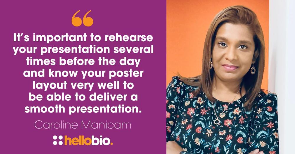
Dr Caroline Manicam is a Principal Investigator at the University Medical Center Mainz, Germany, and was a winner in our 2023 Lab Heroes Awards competition. Caroline has won the award for ‘Best Poster’ in the glaucoma session at the European Association for Vision and Eye Research (EVER) Congress for three consecutive years! She shared her advice on engaging with attendees when presenting a poster at a conference:
I always have a 1-minute elevator pitch ready for the attendees before going into detail during the presentation. As a general rule of thumb, I start by briefly introducing my topic and tailoring my presentation according to the attendees - either a generalist or a specialist. It’s important to rehearse your presentation several times before the actual day and know your poster layout and every detail very well to be able to deliver a smooth presentation.
Impressing the judges
When it comes to making your poster stand out from the crowd and impressing competition judges, there’s lots you can do to give your presentation the edge. We asked Russell Cochrane about his prize-winning poster and he told us what made his presentation stand out from the others: I think my poster stood out because it addressed a really relevant topic — optimizing CAR Treg therapies, which are exciting but also still evolving. I tried to present the findings in a way that was both approachable and impactful, focusing on how adjusting CAR affinity could make Tregs more effective for therapeutic use. I also worked hard to make the poster visually clear and engaging, so people could access and understand the main points immediately, even if they weren’t experts in my specific area. You can present great results, but if people don’t absorb the important information quickly, then it doesn’t matter. Everyone likes a great narrative.
Common mistakes to avoid
Let’s look at some of the most common mistakes researchers make when designing their poster presentations! From too much jargon to poor font choices, alignment issues to colour clashes - here are a few mistakes to avoid when putting your poster together:
-
Too much text - Avoid overwhelming the poster with too much text, but instead use concise bullet points and shorter sentences to get your messages across
-
Small font size - Tiny fonts may be useful for saving space on the page but will be problematic if the text is too small to read
-
Poor colour choice - Think hard about the colours you choose for your poster design. Don’t use colours that clash, or low-contrast text that’s hard to read
-
Filling the white space - Remember that you don’t need to fill every blank space on the page! Use white space strategically to improve readability and focus attention on your key points.
-
No take-home message - Without a take-home message your reader will walk away unsure of the main finding or its significance
TOP TIP: To ensure your poster is readable from a few feet away, keep the title font size to around 85 pt, the headings to around 50 pt, and the body text to 24 pt.
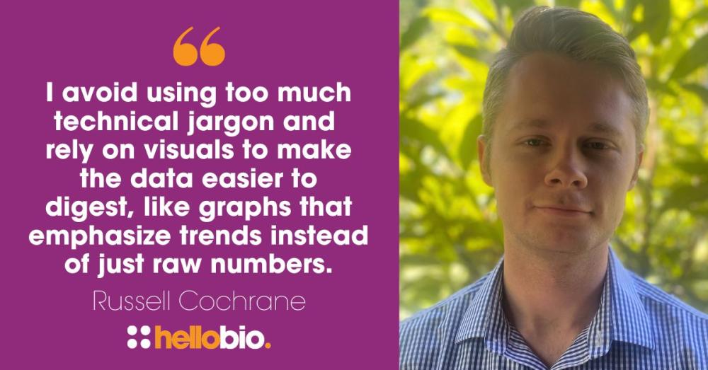
Russell Cochrane adds the importance of avoiding too much jargon, and instead using visuals to emphasize the data:
I avoid using too much technical jargon and rely on visuals to make the data easier to digest, like graphs that emphasize trends instead of just raw numbers.
Matthew Wilkinson said:
The biggest mistake I see is when researchers try to copy and paste their entire paper into a poster shape with all the same figures and figure legends! It ends up being way too complex and hard to read, and sometimes it’s so small you can’t even read the figure text. My other pet hate is when people don’t align their text and visuals to make the layout look neat. One of the Masters students in my old lab will remember the amount of times I told him to align all the boxes in his poster!
Seek feedback from others
Once you’re happy with your design, be sure to ask colleagues and mentors for their feedback. A second, third, or even fourth pair of eyes can be always useful for spotting any errors or design flaws.
Russell Cochrane asked colleagues to look over his poster before submitting it, but also mentioned how helpful it can be to get others who are not familiar with the subject matter to take a look too. He said:
I shared my poster with my colleagues and my PI before finalizing it. It also helps to get people who don’t know your field to look at your poster too. Their feedback helped me figure out what to emphasize.
More advice on poster presentations
For more tips and advice on presenting a poster, take a look at these other great resources from the Hello Bio blog:
- Tips for Poster Presentations at Scientific Meetings and Conferences
- The Life Scientists' Guide to Presenting at Conferences
- Conference Checklist: 10 Must-Dos at Science Conferences
Other advice guides for Life Scientists
The guide is one of a wide range of articles we've put together to help and support life scientists with their careers. Take a look at some of these other great Guides for Life Scientists:
- The Life Scientists' Guide to Lab Harmony
- The Life Scientists' Guide to Applying for Jobs in Industry
- The Life Scientists' Guide to Leadership
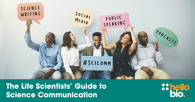
- The Life Scientists' Guide to Science Communication
- The Life Scientists' Guide to Mentoring
- The Life Scientists' Guide to Getting Published
- The Life Scientists' Guide to Lab Sustainability
- The Life Scientists' Guide to Organizing Events & Conferences
- The Life Scientists' Guide to Applying for Grants and Funding
- The Life Scientists' Guide to Examining Your First Dissertation Defense
- The Life Scientists' Guide to Applying for Postdocs
________________________________________________
If you enjoyed this article, why not check out the other resources available on our blog. We are passionate about supporting life scientists including early career life scientists and PhD students - with really low-priced reagents, antibodies and biochemicals, early career scientist grants, and resources to help with both personal and professional development. We know how tough it is - so we hope you find these helpful!
More General Support for Life Scientists
For advice on wellbeing, dissertations, presenting at conferences, wellbeing, PhD support, networking and lots more, we have a huge range of articles to help - just click below:

Save up to 50% on our high purity reagents...
When you get to the stage of planning your experiments, don't forget that we offer a range of low-cost, high-purity agonists, antagonists, inhibitors, activators, antibodies and fluorescent tools (yes - they really are around half the price of other suppliers!) You can use our Quick Multi-Search Tool to search for lots of products in one go, and the range includes:
- Enzyme inhibitors and activators
- Chemogenetic ligands
- Ion channel modulators
- GPCR & ionotropic receptor ligands
- Cell biology reagents & biochemicals

Technical resources
Try our Molarity Calculator: a quick and easy way to calculate the mass, volume or concentration required for making a solution.
Try our Dilution Calculator: an easy way to work out how to dilute stock solutions of known concentrations
We also offer a comprehensive range of technical resources including antibody protocols and methods, product guides and mini-reviews:
And finally, don't forget to check back in with our blog regularly for our latest articles. If there’s something you’d love to contribute to the community, whether that’s an interview or article, drop us a line at hello@hellobio.com
---